After the recent upgrade, many capital letters in Comic Sans are corrupted; is there anything I can do?
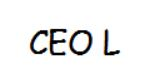
I use Comic Sans for my email font. Just upgraded Thunderbird and all of a sudden the capital letters look odd. Inconsistent size, funny configuration. For example, when I type CEO, the E is larger than the other two letters. Capital L has a horizontal leg that isn't horizontal.
All Replies (10)
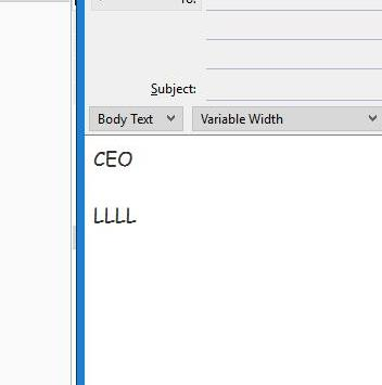
That is how Comic Sans looks like. There is no change. Below I show screenshots from both Thunderbird and OpenOffice Write. The font appears the same as it ever did.

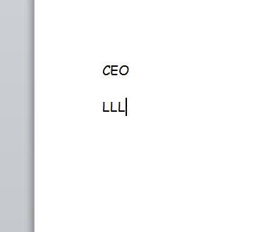
This is how it looks in Microsoft word CEO. All letters the same size. That's how it looked in Thunderbird until the recent upgrade.
You are going to have to show me using screenshots the difference you see for the Comic Sans font between Thunderbird & Word. How do I create a screenshot of my problem? Below the area you type in text here is a Browse button for attaching image files here.
In my screenshots above, it appears to me that the capital E is slightly larger than the capital C & O. Also, it appears to me that the "Capital L has a horizontal leg that isn't horizontal". This is exactly as you have described.
Here are the Thunderbird and Word versions. As you can see, they are quite different. Until the recent update, both versions looked like the Word version.
I have the same as Bruce.
Word 2010, Comic Sans 22pt, Windows 10.
Comic Sans is supposed to look handwritten.

Gewysig op deur Zenos
I get that. But why did it change? I like how it looks in Word.
holmanjon said
I like how it looks in Word.
Then write your correspondence on paper and post it. Email is HTML, that is essentially a web page you email. Word is a typographical tool designed for putting things on paper with a printer. The two really are not as closely related as most people appear to think. It leads to all sorts of ugliness in email, including attachments to email that do not even have a vertical margin because the sender is not aware word layout is printer dependent.
You should also be aware that unlike PDF, email appears to the receiver as a web page, so it does not appear to the person you email the same as it appears to you. (it might, but that is assuming they have exactly the same fonts as you do. Not a good assumption when significant mail is read on phones) When you email folk that did not use Comic sans then what they saw and may still see is possibly any sans-serif font installed. Whatever the browser though was close (they make really bad decisions).
Common font stacks that offer "replacements" include "comic sans ms", "comic sans", "Comic Sans", arial, helvetica, tahoma, verdana.
Gewysig op deur Matt
I appreciate your advice. But none of this explains why everything changed after the last update. Clearly something in the underlying code is different. I guess I'm just stuck with it.
But I have shown you the "wrong" shapes happening in a combination of Microsoft products, Windows 10 + Word 2010. So the change, if that is what it is, appears to be external to Thunderbird.
I don't like this font, so I would never have deliberately installed it. Therefore what I am showing you is Microsoft's default.
Check if you have more than one flavour of it installed.
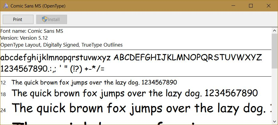
Yes, how your system is displaying the Comic Sans font in Word is not how the Comic Sans font I know and use appears. Your MS Word must be using a different font than the standard "Comic Sans MS".
Go to: C:\Windows\Fonts\
Look to see if you have another font other than "Comic Sans MS" that also uses a similar name. When you double-click on the font, you can see the "Font family details". For "Comic Sans MS", there is four types, Bold, Bold Italic, Italic, and Regular. Double-click on the Regular one, and you should see the same as I show in my screenshot below.