appearance of bookmarks
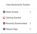
The appearance of my bookmarks has recently changed, and I want to change it back. The individual bookmarks are spread out more, so now they take up more space on my screen and I need to scroll the list. I don't need the extra space, I find it annoying and not at all necessary. I have included images of how it looks now and (a doctored image, granted) approximately how it looked before. I've looked all over and I can't find anything on "Appearance of bookmarks".
Any help would be greatly appreciated. Thank you.
Gekose oplossing
This wider menu item spacing is a feature of the Firefox 89 "Proton" redesign. I can give you a quick short-term workaround, but a more durable solution will require more work.
Temporary Fix
For testing purposes, the developers left a preference in Firefox 89 to switch between new style and old style menus. This is expected to be removed in Firefox 91.
(1) In a new tab, type or paste about:config in the address bar and press Enter/Return. Click the button accepting the risk.
(2) In the search box in the page, type or paste browser.proton.contextmenus.enabled and pause while the list is filtered
(3) Double-click the preference to switch between true (new style) and false (old style)
Some menus may be cut off or sized incorrectly after this change until the next time you do a normal exit/restart of Firefox.
Longer Term Community Workaround
This involves setting up a userChrome.css file. The full instructions are in the following thread: https://support.mozilla.org/questions/1337841
Lees dié antwoord in konteks 👍 1All Replies (2)
You can do that with userChrome.css. https://www.userchrome.org/firefox-89-styling-proton-ui.html#menuspacing https://www.userchrome.org/how-create-userchrome-css.html
Gekose oplossing
This wider menu item spacing is a feature of the Firefox 89 "Proton" redesign. I can give you a quick short-term workaround, but a more durable solution will require more work.
Temporary Fix
For testing purposes, the developers left a preference in Firefox 89 to switch between new style and old style menus. This is expected to be removed in Firefox 91.
(1) In a new tab, type or paste about:config in the address bar and press Enter/Return. Click the button accepting the risk.
(2) In the search box in the page, type or paste browser.proton.contextmenus.enabled and pause while the list is filtered
(3) Double-click the preference to switch between true (new style) and false (old style)
Some menus may be cut off or sized incorrectly after this change until the next time you do a normal exit/restart of Firefox.
Longer Term Community Workaround
This involves setting up a userChrome.css file. The full instructions are in the following thread: https://support.mozilla.org/questions/1337841


