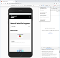
Can FireFox show a mobile device frame in responsive design mode?
In Google Chrome, when switching to Responsive view, there is a setting available called "Show device frame" and "Hide device frame". This is a great little feature that will show the selected mobile device frame around the web content (eg will show an iPhone around the content if you select "Show device frame"). It's fantastic for demonstrating/presenting etc. Is there any way to do this in Firefox? Either through the default product, or any add-ons?
All Replies (2)
That's some nice eye candy. ;-)
Well, a request for enhancement was filed a couple years ago and it's sitting there waiting for a motivated person to pitch in (bug 1278131). Would you be interested in helping code that up?
For discussion on how best to move it forward, I suggest starting with the DevTools forum: https://discourse.mozilla.org/c/devtools
As a very basic-looking workaround, you can inject borders into the responsive design view using an optional userContent.css file. This file is a cousin of the better known userChrome.css file used to modify the user interface. An example screenshot (the third) is attached for inspiration.
If you want to give that a test, when you have a spare 10 minutes:
This assumes you do not already have a userContent.css file. If you do already have a working userContent.css file, you just need to add the rules under (A) to your file.
(A) Select and copy the following style rule code
/* Use CSS borders to create a faux phone frame */
#viewports-container .resizable-viewport {
  border-color: black !important;
  border-style: solid !important;
  border-radius: 20px !important;
  border-width: 45px 16px 75px !important;
}

/* Move the frame closer to the settings bar */
#viewports-container #viewports {
  margin-top: 4px !important;
}
(B) Generate and download a userContent.css file
Open the following page and paste the above rules into the editor, replacing the sample rule:
https://www.userchrome.org/download-userchrome-css.html
Then change the file name selection to userContent.css and click "Generate CSS File". Save the userContent.css file to your computer. (See first attached screenshot)
Use the downloads list on the toolbar to open the downloads folder directly to the new userContent.css file. (See second attached screenshot)
Minimize (don't close) that Windows Explorer window for later reference.
(C) Create a new chrome folder in your profile folder
The following article has the detailed steps for that (#1, #2, and I recommend #3)
https://www.userchrome.org/how-create-userchrome-css.html
I have videos for both Windows and Mac in case the text is not clear.
(D) Move the userContent.css file you generated in Step B into the chrome folder you created in Step C
The next time you exit Firefox and start it up again, it should discover that file and apply the rules to the responsive design view.
Success?
Now... using border images sliced from an actual device would definitely make this prettier, but someone else would be better able to work on that than me.
Modified


