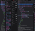
3 Pane Inspector on Vertical Monitor
A large number of developers prefer to use a vertically-oriented monitor, as it provides a more efficient way to read code. However, as demonstrated in the first screenshot, the Firefox developer tools appear cluttered and disorganized when displayed in this orientation, especially when the three-panel layout is enabled. This makes the user interface difficult to use effectively.
In the second screenshot, even with the right sidebar minimized as much as possible by default, a significant amount of screen real estate remains underutilized, resulting in a subpar user experience. The question arises as to how this issue can be resolved.
If the Firefox development team has not given sufficient attention to optimizing their developer tools for vertical monitor orientations, what is the appropriate way to request that this feature be prioritized in their development roadmap?
All Replies (6)
Hi,
The people who answer questions here, for the most part, are other users volunteering their time (like me), not Mozilla employees or developers. If you want to leave feedback for developers, you can go to the Firefox Help menu and select Share ideas and feedback…. Alternatively, you can use this link. Your feedback gets collected by a team of people who read it and gather data about the most common issues.
You can also file a bug report or feature request. See File a bug report or feature request for Mozilla products for details.
Thanks Paul! Here is a link to the request. But I would love to see a solution present itself that doesn't require the Firefox team to build it. It is rather disheartening to see that this is an issue that the Firefox team has had an opportunity to resolve but simply has been ignoring for years now.
Modified
Something is wrong with my idea link...
Modified
Some moderator marked my request as spam! W T F?
The post doesn't even show up in my rejected items list. How do I even resolve this?
The following text and image was the content of the post. Nothing here would even remotely constitute spam:
A large number of developers prefer to use a vertically-oriented monitor, as it provides a more efficient way to read code. However, as demonstrated in the first screenshot, the Firefox developer tools appear cluttered and disorganized when displayed in this orientation, especially when the three-panel layout is enabled. This makes the user interface difficult to use effectively. In the second screenshot, even with the right sidebar minimized as much as possible by default, a significant amount of screen real estate remains underutilized, resulting in a subpar user experience.
The question arises as to how this issue can be resolved? Here are some suggestions for how the Firefox development team could improve the user interface of their developer tools when used with a vertically-oriented monitor:
- Responsive layout: Implement a responsive layout that automatically adapts the UI elements to the available screen space, ensuring a cleaner and more organized interface in both horizontal and vertical orientations.
- Customizable panel arrangement: Allow users to rearrange the panels (e.g., Elements, Console, Network, etc.) to suit their preferences, enabling them to create a more efficient workspace tailored to their needs when using a vertical monitor.
- Collapsible panels: Introduce collapsible panels, allowing users to expand or collapse sections within the developer tools as needed, freeing up valuable screen real estate and reducing clutter.
- Improved tab management: Enhance tab management within the developer tools, enabling users to group, reorder, or stack tabs, making it easier to navigate between different sections when working with limited screen space.
- Optimized font size and spacing: Adjust the font size, line spacing, and padding for the developer tools when used in a vertical orientation to ensure better readability and use of screen space.
- Floating or detachable panels: Allow users to float or detach individual panels from the main developer tools window, providing flexibility to position and resize the panels according to their preferences.
- Preset layouts: Offer a set of pre-configured layouts optimized for different screen orientations and sizes, enabling users to quickly switch between them based on their current setup.
By implementing these changes, the Firefox development team can significantly enhance the usability of their developer tools for users with vertically-oriented monitors, providing a more efficient and enjoyable experience.


