eMail redesigned mesage reader
Not a big fan of the redesigned message header. Now opens a separate window causing unnecessary clutter. Font size so little I can't read neither the "subject," the "from" line, nor the (RS) "timestamp." Selection icon buttons only show up as black boxes. No popup descriptions and attempts to select any fail. The "more" list the same tiny font. I almost always select "view using the classic reader" but then the extra window doesn't close. Very clumsy. At least provide a settings option to choose between the "classic" vs "new" reader.
All Replies (1)
I read this twice, and I am more confused than I have been for a long time. I am not a fan of the V115 supernova, but I can not understand this.
I look at the message header in v102 and beside that the one in the developers daily build. The fonts in the later version are all larger, significantly so. Although I can use the more button to make them about the same small size of the original in V102.
Message in V102

Same message in V118

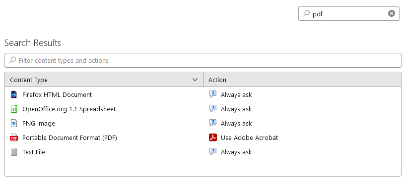
If you select a mail by pressing the enter key or double clicking it, the default is to open a new tab, not a new window, that has not changed in probably 10 years. So I really do not understand your comments of a new window. That ceased to be default when V3 was released and the tabbed interface introduced. As always the setting for this are to be found in the settings menu item. just search the highlighted term in the search box

This view using classic reader must I think have something to do with PDF file attachments, that is the only thing I can think of that might have a classic reader option. That like all other "helper" applications can be controlled from settings.

If your "Selection icon buttons only show up as black boxes" are the buttons in the message header, then perhaps try changing the setting to "use hardware acceleration when available" as rendering is video driver dependent and some just do not work with hardware acceleration.
I also suggest you explore the settings on the view menu for font size and density. Especially as you say.Font size so little I can't read neither the "subject," the "from" line, nor the (RS) "timestamp."

