changing text color changes text size, incidental or bug?
Dear answerneer,
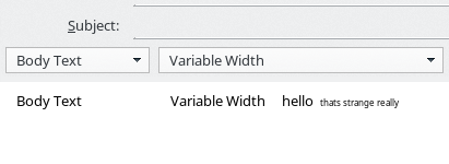
Trying to get the text font right. No avail yet. The text is too bold-like. Setting is Variable Width, which picks the font pointed to in [ Edit } Preferences } Display } Default font ( ? as I understand it ) The font looks overly bold, anyway not the same as other fonts is TDB menus. To see this, type in a new message the text (and required spaces) "Body text Variable Width" right under the drop down menus and try to get the font the same as that as in those drop down menus. ( I assume the font in the drop down menus is a system font, in my case that would be "Noto Sans", same as TDB Display menu Default font) I cannot get it right. Trying to lessen the effect of boldness I wanted to try a lighter color than black. For testing I tried an obvious change to yellow ( in the [ Edit } Preferences } Display } Formatting } Colors section ) The result is that the text *size* gets smaller in the to be written message, color stays black. In the received messages the color indeed becomes yellow.
Q's: Can anyone confirm the overly bold text in writing a new message? Can anyone confirm the color -> size coupling ?
Maybe I have a local install problem, maybe it is a real TDB bug ( although having in install problem can only be to some bug :-) )
TDB version: 45.5.0 sys: Suse Leap 42.1
Thank you for answering.
Ñemoĩporã poravopyre
Problem partly solved: the overly-bold text part. ( The overly-bold is more pronounced on normal larger font size. )
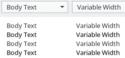
The text in the menus appears to be slightly grey. Therefore the same font looks a little thinner than pure black in the message text on comparable size. The overly-boldness is a font feature not a bug, so change font for thinner appearance.
See screenshot for difference. ( colors #000000 vs #333333 )
The font size change after changing color (and no effect in color) has not been replicated yet. So no urgent problem (if any)
Emoñe’ẽ ko mbohavái ejeregua reheve 👍 0Opaite Mbohovái (3)
I was shown a bug where a Linux user complained about the hinting. I don't know enough to recognize if this is happening for me (or not!) and I suspect it will be specific to a specific combination of font typeface and size, display adapter, monitor etc and so may not be easily reproducible.
Is it over bold if you print it on paper? If so, that would suggest it is a font definition issue, but in reality I'd expect the printout to be different to the on-screen presentation.
I use Linux myself, mostly on a laptop and occasionally on a desktop machine and I haven't ever seen any "too bold" issues on either of them. But in truth, I find way too many places where text is presented in a shade of grey and has too low contrast for my liking (just like here where I am composing in Chrome and this text is all a bit too pale for me), so there's a high chance I wouldn't object to "too bold" if it came my way.
I think you must aim at getting it right in black-and-white. Colours are too subjective and variable, in terms of monitor adjustment, to reliably preserve the appearance you want to achieve. And in some environments, your own text may be colourized by the viewing program to emphasize quoting levels.
I have seen one issue that may be related to yours; if I set selected text to italic or bold, it is often in a different size typeface to the surrounding text. Yet if I examine the html code, there are just the <b>...</b> tags (etc) and no explicit size formatting commands, so it is as if the rendering used for bold and italic is picking up obsolete parameters from somewhere else. I haven't seen your issue with rogue colouring but I do that so rarely I probably wouldn't have encountered it.
Thank you Zenos,
Indeed "text overly boldness" is a subjective thing. For me it is annoying just like for some people caps-lock usage is, you know the "don't shout" feeling.
Tried your print test, nice hint. Because of new setup, I had yet to configure printer, test page o.k. However printing from TDB resulted in printer error twice. Don't know were that problem originates. ( after retry testpage went o.k. so yes there is paper in it ;-) ) BTW maybe rendering (printer driver) also changes things, but might still work for problem isolation.
Printing to PDF however shows overly bold as well.
To alleviate a mistake I made: I should have mentioned the attached screenshot in the parent post itself so one can see the difference for themself.
I agree on getting it right on black/white. That just should work. For me, bold / italics problem you mention does not seem to be the case.
What I did read in the meantime is that the Display menu is supposed to be for incoming messages and Composition for outgoing. Not sure if that is correct though. But the Composition is for outgoing *html* and moreover the text options there are limited in comparison to Display options. Display options do seem to affect new messages, which are - after all - displayed(!) as well. The color changed the font size once. Hard to replicate. (but to be seen in screenshot above)
Best practice is to start new message after changing Display or Composition options Indeed it seems there are old settings kept and / or found and hooked onto.
For the end user this is confusing, and I believe the programmers became confused as well. Not surprisingly since programs are getting more and more complex. Not to bash developers, but I like the "keep it simple" paradigm (so one clearly knows what is going on, and what not. No surprises. "the whole function and nothing but the function " style.) So many settings influencing each other in different places, program & desktop & OS .....
Thanks for you consideration. I hope a solution will show up; so far have always been very happy with TDB. For know I think it is a bug, or I am overlooking something completely.
Ñemoĩporã poravopyre
Problem partly solved: the overly-bold text part. ( The overly-bold is more pronounced on normal larger font size. )
The text in the menus appears to be slightly grey. Therefore the same font looks a little thinner than pure black in the message text on comparable size. The overly-boldness is a font feature not a bug, so change font for thinner appearance.
See screenshot for difference. ( colors #000000 vs #333333 )
The font size change after changing color (and no effect in color) has not been replicated yet. So no urgent problem (if any)


