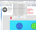
Long text is not visible in the search window.
If the long text in the search box. How to see the whole text in the "Search" window?
Alle antwoorden (9)
Hi Vladislav5, you can widen the Search bar at the expense of the Address bar. If you hover your mouse over the gap in between the two, Firefox should display a double-headed arrow. Click and drag to the left to take space from the address bar and add it to the search bar.
If you prefer not to do that, possibly a custom style rule could widen the drop-down for the search bar. (You can apply custom style rule modification to the UI through a userChrome.css file.) A good place to find or ask for mods like that is the following subreddit, but volunteers here sometimes take an interest and come up with something.
https://www.reddit.com/r/FirefoxCSS/
I have a general site on userChrome.css here: https://www.userchrome.org/
Good day! Thanks for the answer. But there used to be a tooltip. Tooltip is much more convenient. Sincerely, Vladislav.
Vladislav5 said
But there used to be a tooltip. Tooltip is much more convenient.
Oh, I didn't know that. (I don't use search engine suggestions.) When did it change?
You can consider to use the location/address bar to do the searches. The address bar occupies the full screen width via a negative margin-left, but gets a padding via JavaScript to restrict its content width to the width of the address bar showing lots of white.
Add code to the userChrome.css file below the default @namespace line.
@namespace url("http://www.mozilla.org/keymaster/gatekeeper/there.is.only.xul"); /* only needed once */

#urlbar-results {--item-padding-start: 50.00px !important; --item-padding-end: 50.00px !important;}
Bewerkt door cor-el op
I can not say exactly. About 2-3 years ago.
Thank. I find it difficult to follow these tips, because I do not know much English.
It is not that difficult to create userChrome.css if you have never used it.
The first step is to open the "Help -> Troubleshooting Information" page and find the button to access the profile folder.
You can find this button under the "Application Basics" section as "Profile Folder -> Open Folder". If you click this button then you open the profile folder in the Windows File Explorer. You need to create a folder with the name chrome in this folder (name is all lowercase). In the chrome folder you need to create a text file with the name userChrome.css (name is case sensitive). In this userChrome.css text file you paste the text posted. On Mac you can use the TextEdit utility to create the userChrome.css file as a plain text file.
In Windows saving the file is usually the only time things get more complicated because Windows can silently add a .txt file extension and you end up with a file named userChrome.css.txt. To avoid this you need to make sure to select "All files" in the dialog to save the file in the text editor using "Save File as".
You need to close (Quit/Exit) and restart Firefox when you create or modify the userChrome.css file.
Vladislav5 said
jscher2000 saidVladislav5 saidBut there used to be a tooltip. Tooltip is much more convenient.Oh, I didn't know that. (I don't use search engine suggestions.) When did it change?
I can not say exactly. About 2-3 years ago.
Hmm, a lot changed in Firefox 57 as you may recall!
If you are venturing down the road of creating a userChrome.css file, this rule will eliminate the wasted space to the left of the search suggestions on the Search Bar. That will let you see a few more characters. But I can't see any way to show tooltips for the suggestions.
/* SEARCH BAR */
/* Remove empty space left of search engine suggestions */
#PopupSearchAutoComplete .search-panel-tree .ac-type-icon {
  display: none !important;
}
I'm attaching a screenshot showing the results. Of course, it might be simpler to reduce the font size if that wouldn't be too hard on your eyes.
Спасибо!


