How do I change the color used to highlight menu choices?
When I click on one of the menu bar options (for example, Bookmarks) and move my cursor down the column, the highlighted choice is displayed in a light blue - so light that I can barely see it. Is there any way to make the highlighted choice color brighter, or a different color? (Please noted that when I click on a ribbon choice in, for example, Microsoft Excel, the highlighted menu choices under "View" appear in a medium orange color as I roll my cursor over them).
Thanks very much for any suggestions you can offer.
所有回覆 (2)
Hello,
A simpler solution is to install the Stylish extension, and then this style:
You can modify the script a little bit until you are happy with the colours in the User Styles tab of your add-ons page (about:addons) after installing Stylish:
- Tools (or
 ) > Add-ons > User Styles
You can either type in the colour, such as red or orange, or if you want your own:
Then open up Paint in Windows, "Edit Colors", and enter the Red/Green/Blue values there to see what comes out.
The alternative method would be to create/edit your userChrome.css file, see the following for more information:
由 CoryMH 於
Here's a sample rule as more information on how to set it up in Stylish.
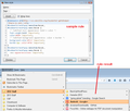
Stylish will add an "S" icon to the main Navigation Toolbar. If it's missing, you may need to use the Customize feature to move it on to the toolbar (or check whether's on an overflow drop-down accessed using a large >> button).
(1) Select and copy the following rule:
@namespace url(http://www.mozilla.org/keymaster/gatekeeper/there.is.only.xul);
#bookmarksMenuPopup menuitem:hover,
#bookmarksMenuPopup menu:hover {
  /* Modified text appearance: bold + color=black */
  font-weight:bold !important;
  color:#000 !important;
  /* Modified background appearance: orange color + border */
  background-color:#fc9 !important;
  border:1px solid #f60 !important;
}
#bookmarksMenuPopup menuitem:hover,
#bookmarksMenuPopup menu:hover {
  -moz-appearance:none !important;
}
(2) Click the Stylish "S" icon > Write new style > Blank style.
(3) Click the lower area next to "1" and paste the rule. A line number should appear for each line.
(4) Click the Preview button to apply the rule, then click the bookmarks menu and hover your bookmarks to see the effect. Success? To modify the colors, you can consult this chart to get the hex codes: http://www.visibone.com/colorlab/
(5) Before saving the rule, type a name in the top box (for example: Bookmarks Menu Higher Contrast)
That's it. Unless there's a problem in Step 4.

