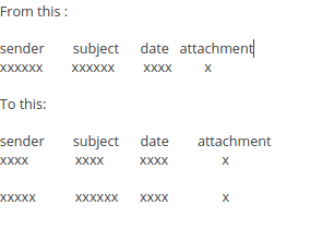
how to increase horizontal spacing between lines the sender from attachment date ect...
I would like to increase the line spacing (horizontal spacing) between the sender from subject date .... area.
I find everything is a bit too close to each other and I get a text overload. I have tried reducing the font size but that is not what I am after. I basically want to double the current spacing.
See image attached...
Hope that makes sense.
Thank you.
Will
Chosen solution
Please try this as I would like to get some confirmation that the userChrome.css file is being accessed.
In Thunderbird
- Help > Troubleshooting Information
- Click on 'Show folder' button
- Close Thunderbird now - this is important
- Click on 'chrome' folder
- Open 'userChrome.css' file
- Completely remove everything in the file, then copy paste the info between lines below.
- save the 'userChrome.css' file
- Restart Thunderbird.
It should make the font a lot larger, please confirm if the font is now significantly larger. This is just a test to make sure the file is being accessed. It is a simple global font alteration.
/*
* Do not remove the @namespace line -- it's required for correct functioning
 */
@namespace url("http://www.mozilla.org/keymaster/gatekeeper/there.is.only.xul");

/* set default namespace to XUL */

* {
font-size: 24pt !important;
}
Read this answer in context 👍 0
All Replies (8)
Your screen size and font sizes are comparable with mine, so 40px ought to make a noticeable difference. If you'd had a very much higher resolution (and correspondingly larger font sizes) you'd need to scale up the 40px accordingly.
Now, your screen shots look OK but let's ask anyway.
There may be several chrome folders on your machine. Two under /home which hold settings for Firefox and Thunderbird, so the path to the Thunderbird profile will be something like
/home/<user name>/.thunderbird/Profiles/<random_string>
Occasionally users look into the Firefox folder by mistake. And note the .thunderbird which makes it hidden by default.
And then the executable program has one too. I can't remember the path to this in Ubuntu. IIRC it's somewhere under /usr/lib/thunderbird/
You don't appear to have made any mistakes here, but it's worth a double check that your userChrome.css file is in the right chrome folder in the right profile.
You can check you're in the right place by using the button in Help|Troubleshooting Information to take you to the active profile folder. Your new chrome folder should be found there (after you have enabled viewing of hidden files.)
Seçilmiş Həll
Please try this as I would like to get some confirmation that the userChrome.css file is being accessed.
In Thunderbird
- Help > Troubleshooting Information
- Click on 'Show folder' button
- Close Thunderbird now - this is important
- Click on 'chrome' folder
- Open 'userChrome.css' file
- Completely remove everything in the file, then copy paste the info between lines below.
- save the 'userChrome.css' file
- Restart Thunderbird.
It should make the font a lot larger, please confirm if the font is now significantly larger. This is just a test to make sure the file is being accessed. It is a simple global font alteration.
/*
* Do not remove the @namespace line -- it's required for correct functioning
 */
@namespace url("http://www.mozilla.org/keymaster/gatekeeper/there.is.only.xul");

/* set default namespace to XUL */

* {
font-size: 24pt !important;
}
HI Toad-Hall yes the fonts got a lot bigger so it is accessing the file.
Great stuff mate..I tweaked the code a little and it worked.
See my image below!!!
woohoo ..thanks for all your effort!! Really much appreciated.
The !important and the end was actually very important :)
Sorted!! Thank you very much.
Not sure if my previous post came through but thank you again, I love the look of Thunderbird now, it looks cleaner, fresher and a whole better and I am also able to see everything much easier.
Here is a better image for future reference... :)
Good to hear all is now working as expected.
Here is the results:
If you don't mind your name is in the email image.
It looks great!


