Firefox 10: How to disable the "The forward button is now hidden until you navigate back" functionality?
Before I upgrade to Firefox 10, I would like to know how to disable the "The forward button is now hidden until you navigate back" functionality that was added to Firefox 10. How does one disable that functionality so that the forward button is always shown?
Chosen solution
Okay, so I just figured out, that if you Right Click the Toolbar, Select Customize and then Put a button between the "Back/Forward" and "AddressBar" it remove the Hidden Forward button...
See in my screenshot http://d.pr/EjrK where the home button is... If I move the Home button elsewhere than the forward button is hidden. http://d.pr/ImFc
Read this answer in context 👍 2All Replies (12)
- Deleted* Answer below
Modified
wdrcomputera means faded-out
What is the point of having a go-forwards button active, if there if nowhere to go forwards to?
Seçilmiş Həll
Okay, so I just figured out, that if you Right Click the Toolbar, Select Customize and then Put a button between the "Back/Forward" and "AddressBar" it remove the Hidden Forward button...
See in my screenshot http://d.pr/EjrK where the home button is... If I move the Home button elsewhere than the forward button is hidden. http://d.pr/ImFc
Modified
Now you have the Refresh button moved outside the Location Bar with the Home button between the Location Bar and the Search Bar. I put the Home button on the left side of the Tab Bar, to get it back close to where it used to be without messing up the "smart" buttons on the Navigation Toolbar. Different strokes I guess.
Yeah, I noticed that after a second look, I corrected it. I dont use the home button anyways since My homepage is just google.com - so i removed the home button completely.
That explains what I am seeing. I put the reload and home buttons back where they used to be.
I read ""The forward button is now hidden until you navigate back" functionality as follows.
In Firefox 8.01, the Back button and the Forward button both exist.
In Firefox 10, the Back button exists and the Forward button does not exist until I navigate to a new page at which time the Forward button comes into existence.
Firefox 8.01:
 Back-button (grayed-out)  Forward-button (grayed-out)

 Navigate to another page, page #2.
 Back-button  Forward-button (grayed-out)

 Navigate to another page, page #3.
 Back-button  Forward-button (grayed-out)

 Navigate to back one page, page #2.
 Back-button  Forward-button

 Navigate back to the original page.
 Back-button (grayed-out)  Forward-button
Firefox 10:
 Back-button (grayed-out)

 Navigate to another page, page #2.
 Back-button

 Navigate to another page, page #3.
 Back-button

 Navigate to back one page, page #2.
 Back-button  Forward-button

 Navigate back to the original page.
 Back-button (grayed-out)  Forward-button
iMarshmellow's second response showed the functionality as I understand and showed above. iMarshmellow's first two responses also show that for now I do not need to worry about the hidden Forward button in Firefox 10 because I already have at least two other buttons between the Back and Forward buttons and the address bar in Firefox 8.01.
I would love to see Firefox give an explicit option that determines the visibility of the Forward button instead of having to rely on a work-around or side-effect.
Thank you.
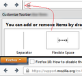
You can also place a separator or space between the back and forward button and the location bar.
Would someone please explain the logic behind treating the forward and back buttons differently? If there is no forward history, you want the forward button gone, but if there is no backward history, you do not want the back button gone. Why?
Obviously, the UI designers are Mozilla are <deleted>. It'd make much more sense to grey out the button instead of hiding it. It's very annoying and distracting for the eye to see the url bar change in lenght/size all the time while navigating through pages.
Clearly, some UI designers show their stupidity at its best. Maybe they thought it's 'smart'. But if this is so smart: If they hide the forward button when there's nothing to forward to, then why don't they hide the back button when there's nothing to navigate back to?
Think from the users perspective: You browse a website and concentrate on its content while at the same time your friggin url bar changes its length all the time while you navigate. Some tiny thing moving up there at the left. This really s**ks!
Edited by a moderator due to language. See the Rules & Guidelines .
Modified
Right-click on the Navigation toolbar (or press Alt+V for the View menu and then T key for the Toolbars menu), then click on "Customize..." to open Customize Toolbar window. From there, add a "Flexible Space" between the back/forward buttons and the address bar. This would effectively separate the two as well as bring the (inactive) forward button back. This should be helpful for those who don't want any button placed between them.
This also applies to versions above 10. The one in the pic is version 14.0.1. Recently did this, which was after updating to 1.4, because I simply found the whole thing aesthetically unpleasing (no offense Mozilla), and I didn't like putting any button between them as I prefer buttons like Home and Bookmarks placed at the right of the address bar.
Loving the new simple look with the border-less buttons. If only Mozilla provided a simpler straight-to-the-point solution for this.
Modified

