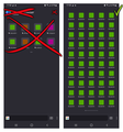
OK Mozilla, this is just bad design, plain and simple.
When are we getting the bookmarks bar? Users have been asking for this feature for YEARS, and yet you keep ignoring us, why? Why is it so hard to make?
You don't want to give us the bookmarks bar? Fine, how about fixing the home screen? Only 2 rows and 2 pages of bookmarks? Are you guys joking? How about, I don't know, 10 rows and five columns, and 10 pages? You don't have to resize anything, you just have to use the space more wisely.
Also, can you get rid of the top left logo? It's a waste of space, I already know I'm using Firefox, you don't have to remind me every time.
Also #2, move the "private browsing" icon to the 3 dots menu.
Also #3, remove the pin icon from the bookmarks tags.
Also #4, remove the grey border of the favicons, it's more space wasted, you really love wasting space and our time don't you?
Sometimes I feel like you are you do things wrong on purpose, is Google paying you to be this bad? Honestly I can't find another answer, I hope I'm wrong.
Todas las respuestas (1)
Hi,
The people who answer questions here, for the most part, are other users volunteering their time (like me), not Mozilla employees or developers. If you want to leave feedback for developers, you can go to the Firefox Help menu and select either Share ideas and feedback… or Submit feedback…, depending on your Firefox version. Alternatively, you can use this link. Your feedback gets collected by a team of people who read it and gather data about the most common issues.
You can also file a bug report or feature request. See File a bug report or feature request for Mozilla products for details.


