

Thunderbird 78 Apppearance and Folder icons
This may have been noted before, but the Thunderbird 78/80 design seems to have devolved into the lowest common cell phone style appearance.
On large high-res desktop monitors the font is thin, wiry, hard-to-read and the overall interface is dominated by white-space.
The folder icons may be scalable, but they are ugly and not nearly as informative as the older version 68 color icons. Changing the icon color just emphasis the useless ugly appearance.
I don’t comprehend the reasoning and design principles that were behind this interface design.
Yea, I know, change is a b*****.
All Replies (4)
Not everyone uses the same OS nor screen resolution nor has the same pixels size settings in Thunderbird nor same eyesight.
The previous icons were much 'prettier', but the previous icons were PNGs, which are not scalable and it did cause various issues for people. There is nothing worse than fuzzy icons. The developers had to take this into consideration to find a solution that was more inclusive. The new icons are Photon icons and come only with the thick outline. They have been used generically throughout Thunderbird for other icons for quite a while. Photon icons have been designed to be scalable and the developers have managed to include an option to choose whatever colour you want. This a new option. Right click on folder and choose 'Properties', you will see a 'Folder icon' colour option which is clickable to choose a colour.
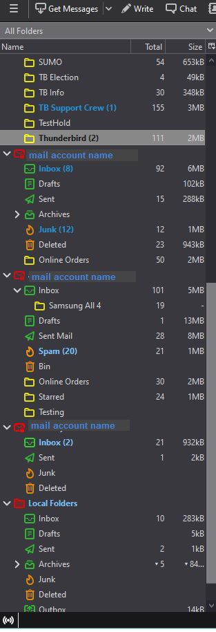
I have setup a userChrome.css file which has auto set colours on the entire lot, so I never need to set a colour if I add an account or add a folder. account folder =red Inbox, Sent, Drafts, Archive, Outbox = green Junk/Spam and TRash = orange All folders created = yellow
Additional tweeks Two blues for new mail and mail unread Highlighted uses a paler grey with black text.
It's ok for now, but I'll probably experiment further when I have time. See image.
But if you do not want any icons - It is also possible to use the 'userChrome.css' file to complete remove all icons and close up the space.
Toad-Hall modificouno o
Some people suffer from colour blindness so offering a choice of colour is important. Some people need to use High Contrast to differentiate, so a linear clear outline works well.
Some people had blocks of colour icons that looked too simliar, they do not see the intricate detailing and other could not see them at all.l eg: Icons for Drafts and Templates were pale and disappeared. Many suffered from fuzzy icons so the icons had to be scalable.
When you see everything OK, it can seem an unreasonable choice to use a simplied outline design. This offers a solution which is inclusive and easily modified in respect of colour.
Thank you for the replies. I understand some of the reasoning behind the redesign of the Thunderbird.
It's admirable that Thunderbird was changed in an attempt to make it more friendly to certain users.
But - the redesign leaves very much to be desired in appearance for a Windows user. The thin, wiry, small, hard to see font - the ugly, small, hard to decipher Android-like folder icons - and too much disconnected white space that makes it difficult to follow lines across the screen may be a design that attempts to achieve a certain degree of lowest common denominator universality, but does nothing for the esthetics and does not make for a very satisfying user experience. We're no longer using VT100 terminals with limited display characteristics and it's unfortunate that the Thunderbird developers couldn't do better and take advantage of modern screen fonts, icons, and layouts.
Don't mean to offend - just the opinion of a long-time Thunderbird user - and I'm sticking to it.
No offence taken, I liked my old icons and if i had a choice, I'd still be using them. For a start, I did not have to have two sets of code to reconfigure different colours for folders based on theme set as Light or Dark. Yellow folder just does not work as outline only in the Light theme, it really needs to be a solid otherwise it fails miserably. I've gone over to using dark in 78*, whilst still using Light in 68*
But I'm wondering what your view looks like. You can see my image of the Folder Pane and I would not describe it as having these issues.
- thin, wiry, small, hard to see font
- small, hard to decipher folder icons
- too much disconnected white/dark space that makes it difficult to follow lines across the screen
Can you post an image of your Folder Pane ?