

Compose window: reduce wasted space and increase space for headers?
Hi,
Please see the attached image.
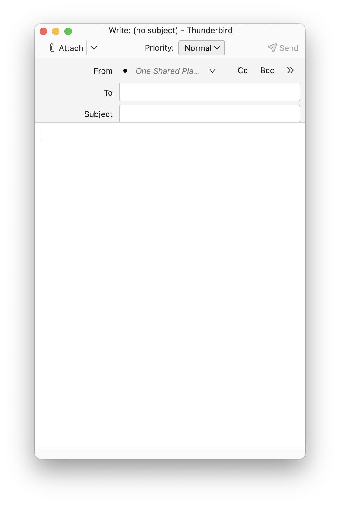
In the header section of the compose window, the header fields and field labels are indented from the left edge of the window. This design wastes space and reduces the space available for the "From", "To" and "Subject" fields. The designers seemed to assume that everyone would use a very wide compose window. But text is composed and read more easily in a narrower column of text. The attached image shows a typical width in my use. Note that the sender's e-mail address does not even appear and the sender's e-mail account name is truncated.
Question 1: Why was the window designed this way? (Am I not understanding something?)
Question 2: Is there some way to move field labels and fields, perhaps with a setting in the Config Editor, to the left edge of the window?
Question 3: How does a person suggest/request a design change?
Many thanks for any help.
Rick
Wubrane rozrisanje
Hello sfhowes,
Perfect! Just beautiful. And an extremely quick response from you. Thank you very much!
Rick
Tutu wotmołwu w konteksće čitać 👍 1Wšě wotmołwy (2)
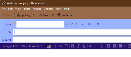
Try this method with css:
#MsgHeadersToolbar {
  background-color: #99b3ff     !important;
  height:           min-content !important;
  color:            #23008c     !important;
  margin-left:    -70px         !important;
}
Help/Troubleshooting Info, Profile Folder, Show in Finder (Win:Open Folder), close TB, create a new folder named chrome, create a new document in chrome with a text editor, name it userChrome.css, Save as type: All files *.*, copy in the above code, change the margin number as desired. Delete the colour and height statements if unwanted. Double-click toolkit.legacyUserProfileCustomizations.stylesheets to true in Settings/General/Config. editor, restart TB.
video on how to create a css file (Firefox and TB)
See attached picture.
Wubrane rozrisanje
Hello sfhowes,
Perfect! Just beautiful. And an extremely quick response from you. Thank you very much!
Rick