

In FF 75, why doesn't awsum box have icon to identify tabs already open?
In the past, when I wanted to go to a tab I'd opened previously, I'd type a keyword in the awesome box in the taskbar. A drop-down box with possibilities appears. I'd get 10 search results, 5 new, some historic and one or 2 the ones I might be wanting to switch to. For these last ones, there'd be a grey icon on the left, so that I'd know which to click on. With FF75, the format has changed. For existing tabs, there is no icon, but the option 'switch to tab' is indicated to the right of the tab address. That is OK for a short tab address, but when it is long, like the one for this page, viz: https://support.mozilla.org/en-US/questions/new/desktop/tabs/form?search=In+FF+75%2C+why+doesn%27t+awsum+box+have+icon+to+identify+tabs+already+open%3F&step=aaq-question the option 'switch to tab' is way to the right and can't be seen as the drop-down box is fixed, can't be dragged wider, text in box can't be moved. To take the guesswork out of which to select and to avoid opening a new tab, PLEASE can we have teh indicative grey icon back again!
선택된 해결법
Can you see a tiny green tab icon superimposed in the lower right corner of the site icon like this? Depending on the color contrast or lack thereof, it can be very subtle:

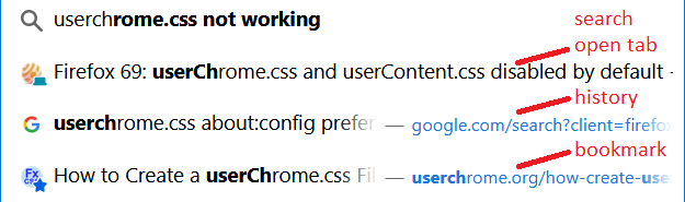
It is possible to modify the layout of the icons on the drop-down, but it's a little bit of a project because you need to dive into the world of userChrome.css.
문맥에 따라 이 답변을 읽어주세요 👍 1모든 댓글 (2)
선택된 해결법
Can you see a tiny green tab icon superimposed in the lower right corner of the site icon like this? Depending on the color contrast or lack thereof, it can be very subtle:
It is possible to modify the layout of the icons on the drop-down, but it's a little bit of a project because you need to dive into the world of userChrome.css.
Subtle! definitely! I'd more-or-less dropped onto the feature of using the awsome bar to get to loved tabs. In the past, some exist, and were marked with the grey icon, others would overwrite the current tab. Now, I can look for the green dot. I can't think that I'd have spotted this subtlty by happenstance! Clear enough for me now, and I'm glad to have had this pointed out, but would a novice spot this? Thank you, Jscher2000, but please suggest to the developers that something more eyecatching would be helpful for the novice!
글쓴이 henryfm 수정일시