How do I make the spinning circle green again?
From a recent update (to FF40 I think) the spinning circle is blue. It is now lost in amongst everything else that is blue. This follows on from Google changing some accenting from red to blue for some reason, but this sin;t important right now (unless anyone can change this also).
Anyway, I want the spinning circle to be green, so I can see it. My theme has a blue background, websites are almost always blue, or blue themed, everything is blue so the spinning circle is hidden. It needs unhiding.
Усі відповіді (8)
There are so many spinning circles... where is the one that you want changed? On the tab?
I notice a similar thread on MozillaZine which might be a good place to follow up if you don't get a solution here (either a custom style rule or an add-on will be needed):
Are you using a lightweight theme (Persona) that has a blue background?
A normal (complete) theme should include a throbber with a suitable background.
The throbber uses two list-style-images, one for connecting and one for loading. The latter is red for me on Linux.
- chrome://browser/skin/browser.css
Can you attach a screenshot?
- http://en.wikipedia.org/wiki/Screenshot
- https://support.mozilla.org/kb/how-do-i-create-screenshot-my-problem
- Use a compressed image type like PNG or JPG to save the screenshot
- Make sure that you do not exceed the maximum size of 1 MB
See also:
- Throbber Restored: https://addons.mozilla.org/firefox/addon/throbber-restored/
Sorry yes, it's the one on the tab.
I'll keep an eye on the mozillazine thread, but tbh it's a bit excessive considering there was no need to change it (without making it easily revertable). I need to go through my current profile and cherry pick mods and tweaks to add into a new profile as there are various issues with this profile that I just can't fix, but I can't just start with a new profile as this one has been with me for many years and contains lots of info that is useful (saved logins, useful history locations etc). There are far too many changes for changes sake.
OK, so with a bit of digging (thanks to some pointers from the mozillazine link for where to look for clues) I think I need to change this to the old version;
chrome://browser/skin/tabbrowser/loading.png
Not sure how to go about it though.
ETA: So I think I have found out what to do now. Edit the userChrome.css to point to a loading.png in the chrome folder that is green.
It would be easier to just swap the loading.png to a green one, but where is it though?
Змінено
I'm obviously doing something wrong, adding
  .tab-throbber {
  filter: hue-rotate(-90deg);
  }
to userChrome.css doesn't seem to do anything. Have I missed something?
Also tried
  .tab-throbber[progress] {
  filter: hue-rotate(-90deg) !important;
  }
and every combination of all of the above.
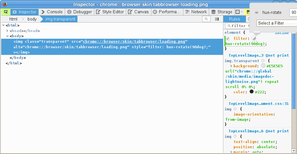
Works for me if I test this by opening the image in a tab.
- chrome://browser/skin/tabbrowser/loading.png
Can you post the full content of the userChrome.css file?
You can open the file in a browser tab or in the Scratchpad (Firefox/Tools > Web Developer).
@namespace url("http://www.mozilla.org/keymaster/gatekeeper/there.is.only.xul"); /* only needed once */

.tab-throbber[progress] {filter: hue-rotate(90deg);}
Змінено
Sorry, was away from the thread for a while. Changes to userChrome.css only take effect after you exit Firefox and start it up again. If you didn't have a userChrome.css file before, make sure it is in a lower case chrome folder in your currently active profile folder.
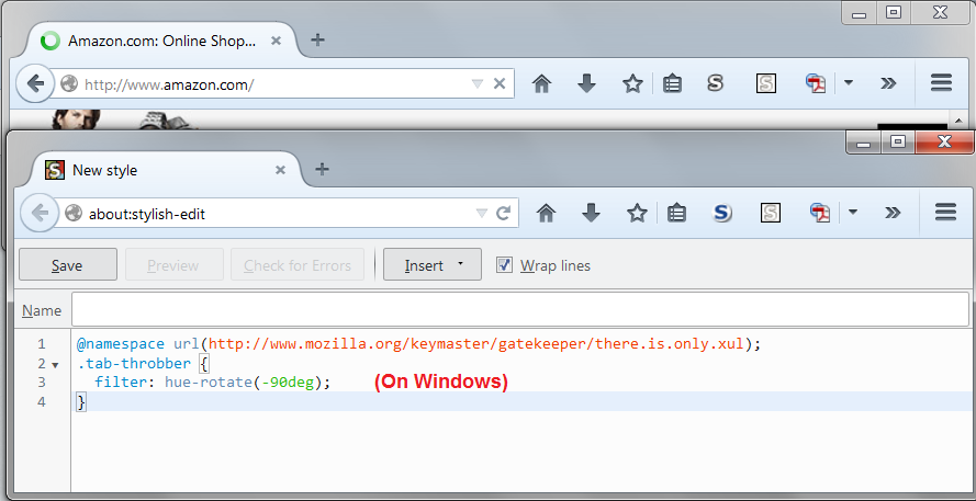
Attached screenshot is using Stylish, which I find easier...
OK so it would seem that there is something in one of the themes or add-ons that is stopping the userChrome.css from being applied.
I have however found a setting in Classic Theme Restorer that restores the green throbber.
I will have a closer look at this profile and try and clean it up a bit as it is now clear that it isn't too healthy in general. Many thanks for your replies and assistance gents. :)


