Thunderbird layout
Using 128.4.3esr. Cannot get emails to default to classic view. Is there a way?
Tất cả các câu trả lời (9)
Sorry, David.
The closest I could come to providing the image you requested is my upload from 11-19.
A problem fulfilling your request is that we cannot get the view to show you what we want. That is the problem, is it not?
So, for now, the closest is the uploaded image I mentioned.
Happy Thanksgiving.
Hey, Don.
Have you also noticed that when you put a message in trash, the text disappears but the message remains on screen? Also, the next message fails to appear?
There are other glitches I am experiencing and, yes, I also believe this happened after an update.
Okay, I regret we could not solve this. The View menu should show options for classic, wide, vertical, and if not, there may be corruption somewhere. Downloading from thunderbird.net and installing over the current version may be worth considering. And all the best to you this coming Thanksgiving. :)
@temp18 - indeed, that's been a continuing issue I've had with the latest releases of TB. The update of the preview screen often takes 30-60 seconds to happen, and sometimes it never happens. I've never correlated that to deleting a message and expecting the next one to appear - I'll have to watch for that. It's a REALLY big annoyance.
TB used to be great because you could move through email quickly and efficiently—now, with the updates, that's not happening anymore, and it almost seems a native web-based reader may be a better answer for things like my Gmail accounts.
I understand exactly what you mean about the issue with the preview screen layout. I don't think David understands the issue, though. I'll see if I can do some screen captures that illustrate it. The fact that the preview window is saddled with a group of obscure icons that really don't represent what they do, instead of easy to understand and click buttons (with text on them like "Delete" "Junk" etc..) and no way to revert to that display format seems to mean the TB developers are taking off on their own without user feedback.
Sad - it was such a great program - almost as good as Eudora..
Funny, my wife started using Eudora in the 90s and she still uses it. And I have been warned to leave it alone. She loves it. (But her email account doesn't need Oauth2.)
Here are a few images....
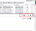
See the icons in the red box? Those used to be buttons with text on them. There is no reason on a PC to iconize everything, especially using icons that don't resemble anything I've seen used before (with the exception of the trash can.)
How about an option to change these to buttons, like the ones shown in the Quick Filter panel (2nd image)
By the way, for a while, there was a version of Thunderbird designed to look like the classic Eudora. It almost, but not quite, made the grade. I don't know if that work has been continued or not.
First, you are always open to make suggestions: connect1.mozilla.org and click the IDEAS page. Second, that Eudora version never made it.
Thank you both for trying to get this resolved. Your efforts are much appreciated. Happy Thanksgiving.


