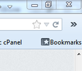
How do I remove the "More tools" button that appears next to the address bar?
Yesterday I updated my Windows 7 computer to Firefox 33. Now the search bar is hidden in a "More tools" option, a double chevron button on the right of the address bar.
I open the configuration menu and there's no icon for the button, so I can't remove it..
How do I remove that "More tools" button and restore the search bar to the right of the address bar?
所有回复 (7)
Please provide a screenshot of the full toolbar area (at least) so we can see what is happening.
https://support.mozilla.org/en-US/kb/how-do-i-create-screenshot-my-problem
It is best to use a compressed image type like PNG or JPG to save the screenshot and make sure that you do not exceed a maximum file size of 1 MB.
Then use the Browse .... button below the Post a Reply text box to upload the screenshot.
When there are too many tools / icons / entries on a tool bar, that is what happens with the overflow. What you could do is add another tool bar, and place some of the overflow there. I also place my search box there, giving me lots of room for the address bar and many icons.
Same issue for me, though it's not the search bar, just some regular plugins and a home button
As NaBUru38 mentioned, the menu chevrons completely disappear in customise mode, so there doesn't seem to be any way to move them out of it easily.
The url bar should be variable width and there's more than enough room for the three icons, not sure why they're suddenly being condensed
FluffySquirrel,
That is happening for you due to the Search Bar being moved from the Navigation Toolbar. The Location Bar automatically expands to fill the Nav-Bar and the buttons go to overflow with the double ellipsis (>>).
You'll need to set the max length of the urlbar container stop that overflow.
Add the code below to the userChrome.css file below the default @namespace line. You'll need to create the /chrome/ folder and a plain text userChrome.css file for your Profile folder per this article.
@namespace url("http://www.mozilla.org/keymaster/gatekeeper/there.is.only.xul"); /* only needed once */

#urlbar-container {max-width: 400px !important}
You can make it longer by using a larger max width, like 600 or other.
As I said, I have the search bar next to the address bar, so that's not my issue.
When I close and open Firefox, sometimes it gets fixed and sometimes it gets wrong.
NaBUru38,
My posting was for FluffySquirrel, whose screenshot showed the Search Bar as missing from the Navigation Toolbar.
On your installation, I think the CTR addon is messing things up. But that userChrome.css code should work for you, too. But add this code to keep the Search Bar from expanding.
#search-container { max-width: 200px !important; }
There is a Classic Theme Restorer support thread over here. http://forums.mozillazine.org/viewtopic.php?f=48&t=2827985&start=1530
Do you have any code in userChrome.css that deals with buttons on the Navigation Toolbar?
I get this when I apply a negative margin-right to toolbar buttons to space them more closely (a negative margin-left works).
Can you post the content of the userChrome.css file?


