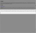
Dialog confirm boxes are too wide for the page and dissapearing off the right side in the sites we have developed. This is new. How do we fix?
In both Windows and Mac the confirm dialog boxes are now opening too wide. It extends off the right side of the page and therefore hides the user action buttons. The website does not have horizontal scroll bars.
When you re-size the browser window, the dialog box re-sizes to the correct size. As site developers, how can we prevent this happening?
被采纳的解决方案
Can be this bug:
- bug 686469 - Tab-modal alert can overflow the browser window
(please do not comment in bug reports)
定位到答案原位置 👍 0所有回复 (5)
Are the websites displayed correctly otherwise?
See also:
Thank you for your reply.
Yes everything else is fine. I have attached a screenshot of a test page we created, it is not website specific.
It is also happening on multiple machines/OS in different locations and only since the Firefox upgrade where the dialog boxes now use the lightbox effect. So I don't think it's a file corruption issue.
The dialog box is opening at about 120% of the window width and is therefore disappearing off the right edge and hiding the "cancel"/"confirm" buttons.
选择的解决方案
Can be this bug:
- bug 686469 - Tab-modal alert can overflow the browser window
(please do not comment in bug reports)
Yes, that's it! I was hoping there would be something I could do in the code to stop it. Guess not :/
Thank you for pointing that out.
Best!
You're welcome

