

FF Responsive Design mode looks differant than in Chrome developer tools
Hi.. I created a responsive web page. Why does it look good in Chrome developer tools , iPhone6 for example. But in FF Responsive Design mode for iPhone6 is does not scale and looks bad, requires scrolling. See the screenshot - Chrome vs FF (side by side) thx in advance!!
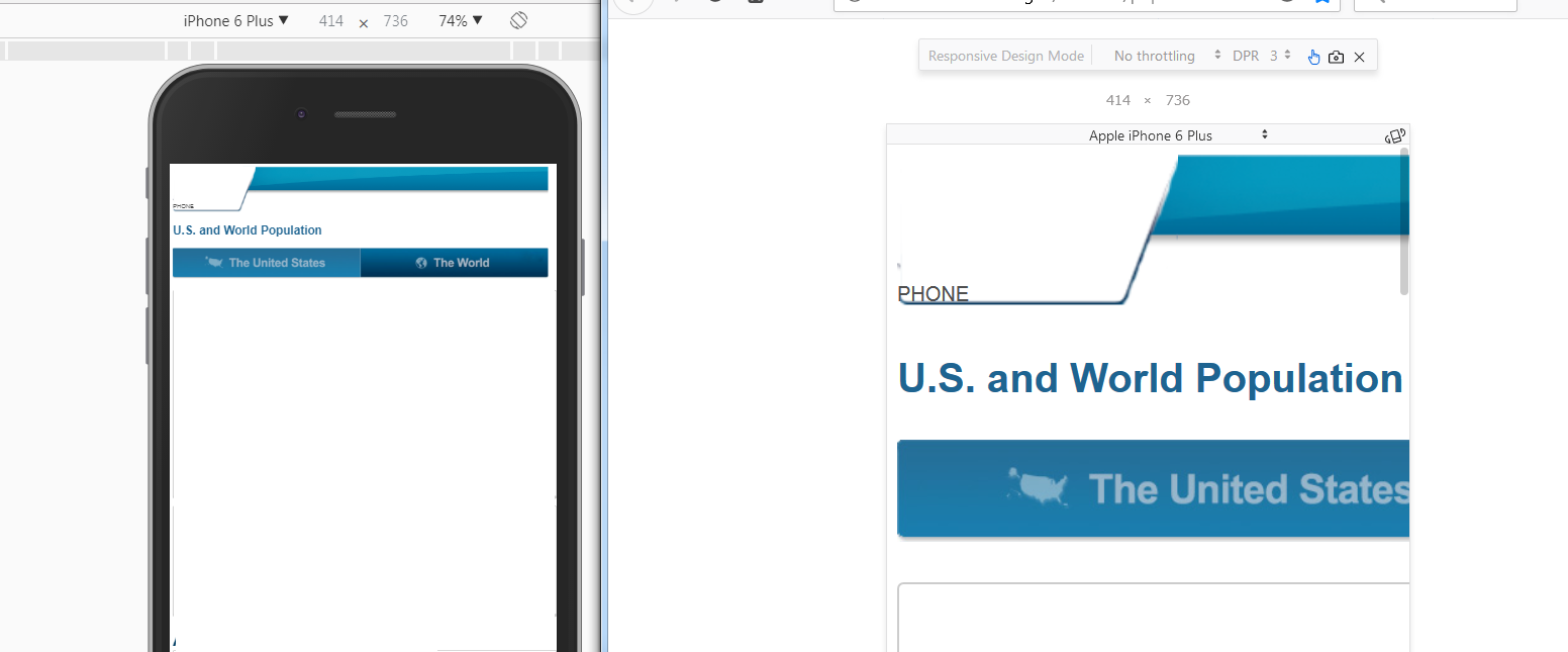
Hi..
I created a responsive web page. Why does it look good in Chrome developer tools , iPhone6 for example. But in FF Responsive Design mode for iPhone6 is does not scale and looks bad, requires scrolling. See the screenshot - Chrome vs FF (side by side)
thx in advance!!
Krejt Përgjigjet (3)
See screenshot
Try to ask advice at the Stack Overflow forum site.
Hi.. I did ask on Stackoverflow... no responses