Noto Hieroglyphics shifted up with writing-mode: vertical-lr;
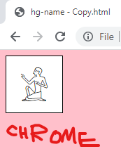
When using Noto Sans Egyptian Hieroglyphics font and writing-mode: vertical-lr; the characters appear shifted up by ~10%, thus appearing partially outside their parent element. All hieroglyphics do this (here using (U+13000)), but only with Noto font.
Tested on versions 114.0.2 and 79.0esr, on different machines, new installs, old installs, even the mobile version. Chromium-based browsers don't have the issue. Images show character inside a div (with borders), the same character highlighted, and Chrome screenshot for comparison. TO REPRODUCE just import and set Noto Sans Egyptian Hieroglyphics and writing-mode: vertical-lr/vertical-rl/tb/tb-rl. A bordered div around the characters might be useful.
Zgjidhje e zgjedhur
Version 2.001 of the Noto font fixed the issue. It's not deployed to Google Fonts yet, but repo's files work. Now Chrome and Firefox both display the font properly (except Chrome's text highlighting goes a little outside the block - not an issue)
FontForge issue persists, but it's outside the scope.
Lexojeni këtë përgjigje brenda kontekstit 👍 0Krejt Përgjigjet (6)
Ok, I checked some more fonts, and apparently a font called NewGardinerSMP has the same problem. Also tested Aegyptus, Segoe UI Historic, Aaron UMdC Alpha - those work properly. I also checked some other browsers: Palemoon and Lunascape Orion (gecko engine) have the same problem. Safari, Safari iOS, Avant, qutebrowser, Lunascape Orion (Trident and Webkit engines) - work properly. Internet Explorer 11 doesn't support vertical-lr. Also checked operating systems - XP (last supported FF version), Windows 8, Windows 10, Windows 11, macOS Ventura, Android, iOS - makes no difference.
I found that a program called FontForge displays those fonts in the same improper manner, I'll try to edit the font, shift the characters down, and we'll see if it works on FF and Chrome
Hi there,
Thank you for bringing this issue to our attention. I understand that when using the Noto Sans Egyptian Hieroglyphics font with the writing-mode: vertical-lr; property, the characters appear shifted up by approximately 10%, causing them to be partially outside their parent element. This issue seems to be specific to the Noto font and doesn't occur in Chromium-based browsers.
To reproduce the issue, you can import and set the Noto Sans Egyptian Hieroglyphics font and apply the writing-mode property with various values such as vertical-rl, tb, or tb-rl. Adding a borderedAs a Firefox support volunteer, I will investigate this further and try to find a solution or workaround for you. In the meantime, please note that I will need some additional information to assist you more effectively:
Can you provide the specific version of Firefox you are using on Windows 10? Are you experiencing this issue on all websites or specific ones? Could you share any code or a live example that demonstrates the issue? Have you tried clearing your browser cache and restarting Firefox to see if that resolves the issue? Once I have these details, I'll be able to provide you with a more accurate response or further troubleshooting steps.
Thank you for your patience, and I look forward to assisting you further on the Firefox Support Forum.
Best regards, Suram Firefox Support Volunteer
suram080 said
Can you provide the specific version of Firefox you are using on Windows 10? Are you experiencing this issue on all websites or specific ones? Could you share any code or a live example that demonstrates the issue? Have you tried clearing your browser cache and restarting Firefox to see if that resolves the issue?
Firefox versions used on Win10: 114.0.2 (64-bit) and 79.0esr (64-bit). As of yet, I haven't seen the issue in the wild. Only on my own sites and in a program called FontForge. Clearing browser cache, restarting it, installing it anew on a fresh system - doesn't help.
Minimal code needed to replicate the issue can be found in this html file.
Alright, I found a solution. I edited Noto font file and shifted it down a little. Now it displays properly. For some reason it didn't change Chrome's rendering - now both display properly. I'll look if someone has published such edit before. If not, I'll figure out if it's legal, and maybe publish it on github myself.
Actually [2.001] fixed that issue for Firefox. It hasn't been deployed to Google Fonts yet, but the files work alright. The only difference is selecting text - Firefox highlights only the block (as it should), but Chrome highlights a couple pixels wider on the sides, it goes outside the block a little. Not a problem tho.
FontForge still has the issue, but it's outside the scope.
Ndryshuar
Zgjidhja e Zgjedhur
Version 2.001 of the Noto font fixed the issue. It's not deployed to Google Fonts yet, but repo's files work. Now Chrome and Firefox both display the font properly (except Chrome's text highlighting goes a little outside the block - not an issue)
FontForge issue persists, but it's outside the scope.


