How do I remove toolbars from the titlebar?
How do I remove the tool bars out of the title bar area, specifically the Menubar? I HATE them up there! I don't care for personas or any of that stuff, I just want my menu and buttons to be on the standard boring solid background, not in the glass title bar area, with this ugly flushed out coloring behind it. I think it's awful looking.
I found that if I also move the tabs to the bottom, the navigation bar also goes up into the title bar. Again, I find this awful, but I found a way around it by creating a custom menu and then moving the navigation controls to it. I tried this with the menu as well, but they don't move.
How do I change this so only the title is in the title bar? I can't find anything on this anywhere. My guess it that, it's just some designer's ugly joke, or dream whatever, and I'm stuck unless I downgrade, but thought I'd ask in hopes it can be done and in case anybody else is looking for the same peace of mind.
Thanks.
Krejt Përgjigjet (9)
goto to View->Toolbars and unselect those that you doesn't want to see. Is that what you needed?
Do you use the classic menu bar? If you have that turned on, it should prevent other parts of the browser chrome from sliding up into the title bar when you maximize the window. It also should never slide up into the title bar itself.
If you prefer the orange Firefox button, you might need to override some style rules to keep that area clear. (Beyond the scope of what I can do at this hour.)
As for the Windows 7 "aero" shower door look, you can disable that system-wide by choosing a Basic theme in Windows display settings. I don't know of a way to disable it just for Firefox, although with a combination of different style rules you might be able to get close.
Forgot to mention: to turn toolbars and the menu bar on and off, you can:
- right-click a blank area of the tab bar
- tap the Alt key to display the menu bar temporarily, then use View > Toolbars
Hi, Thanks for the responses!
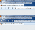
I've included a graphic that I think helps illustrate what I am looking for. The top part of the image shows FF with tabs on top. Look at the navigation tool bar. This is what I want my menu bar (and all other too bars) to look like at all times.
Now look at the bottom part of the image, this is without tabs on top. See how now the navigation tool bar now looks like it's part of the title bar, this is what I don't like and don't want ever (no matter where the tabs are).
How do I accomplish this? I just want my title bar to be a title bar and my tool bars to be tool bars. Is that so much to ask?
Any help to documentation or something that can at least point me in the right direction on how to accomplish this would be helpful if there is no direct solution (in which case, bad designers, BAD!). I really am just hoping there was some forethought into this and there's something easy in config to switch (fingers crossed!).
Thanks.
Are you using a persona (lightweight theme)?
Start Firefox in Safe Mode to check if one of the extensions (Firefox/Tools > Add-ons > Extensions) or if hardware acceleration is causing the problem (switch to the DEFAULT theme: Firefox/Tools > Add-ons > Appearance).
- Do NOT click the Reset button on the Safe Mode start window or otherwise make changes.
- https://support.mozilla.org/kb/Safe+Mode
- https://support.mozilla.org/kb/Troubleshooting+extensions+and+themes
Try to disable transparency in Windows.
Right click in a free space on your desktop.
Left click on Personalization.
There are four options at the bottom of the screen, choose "Window Color and Appearance".
Select a border color
Uncheck: "Enable transparency"
Not sure if you looked at what I was saying or just giving me a cut and paste auto-response, which is what it looks like to me. So thanks for the suggestion?
Transparency does nothing, it's STILL looking like the titlebar. If I disable windows aero theme and make it classic, then it's ok, but I don't want to change ALL of windows, Just FF as it's the only App that I use that does this (oh and thunderbird is like this too, which I also now HATE!!! since they did this). Why are you doing this Mozilla! It's SO AWFUL! WHY?!? WHY CAN'T I CHANGE IT BACK!?! WHY!?!?! AHHHH!!!!!!!!!!!!!!!!
I know IE is like this, but I don't use IE... Wait is that it? You're trying to be like IE? NO! Please NO! I Just want the regular decent UI back. PLEASE!!!!!
Does anybody understand this? Am I really that alone on this?
Try a solid theme (persona) with a color that suits you.
Does anybody understand this? Am I really that alone on this?
You are somewhat alone on this because you are positioning the toolbars above the tabs. When the toolbars are on a tab, they automatically have the opaque background of a tab. You illustrated this in your screenshot.
Anyway, cor-el's solution will solve your problem (unless you use permanent private browsing mode, but that will be fixed in Firefox 21).
I don't understand it either.

